

Monday, October 24, 2011
more undead
Monday, October 17, 2011
ZOMBIEEEEEEEEEEEEEEES!
Exclusive first look at concept sketches for Kevin Zombie:
Character: Kevin Donoghy
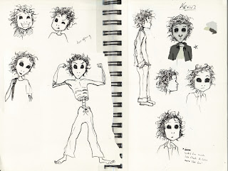
Character: Kevin Donoghy

Monday, October 10, 2011
Valley of the Dolls
Man, I've been slack about my updates. What is it about Fall that feels like it must over-compensate for the chill torpor of summer?
But hey! It's October! Time for some Hallowy-weenie, creepy, ghoulie, ghostie posties: Let's talk about Voo-Doo Dolls!
I've been a doll nut since I was a kid. Most little girls are, but most out-grow it. I never did. But my mother had views on most of the commercially offered dolls, so my sisters and I mostly made our own. It's a hobby I enjoy to this day, and one that led to a passing fascination with voo-doo dolls.
Voo-doo dolls are really just one version of a doll made with the intent of interacting with a spirit, and working related magic. Other such dolls include Worry Dolls, dolls meant to take away stress or problems merely by a person voicing their concerns to them, Corn Dollies, dolls made of wheat or corn chaff said to hold the spirit of the harvest through the winter to be released in the spring of the following year, and Fertility figurines, self explanatory.
When most people think of voo-doo dolls they think of a dreadful and vindictive sorcerer woman sticking pins in a doll meant to inflict pain upon an unfaithful lover or the like. Wikipedia has this to say about the myth:
"The practice of sticking pins in dolls has history in folk magic, but its exact origins are unclear. How it became known as a method of cursing an individual by some followers of what has come to be called New Orleans Voodoo, but more appropriately Hoodoo (folk magic), is unknown. This practice is not unique to Voodoo or Hoodoo, however, and has as much basis in magical devices such as the poppet and the nkisi or bocio of West and Central Africa. These are in fact power objects, what in Haiti is called pwen, rather than magical surrogates for an intended target of sorcery whether for boon or for bane. Such Voodoo dolls are not a feature of Haitian religion, although dolls intended for tourists may be found in the Iron Market in Port-au-Prince. The practice became closely associated with the Vodou religions in the public mind through the vehicle of horror movies and popular novels.
There is a practice in Haiti of nailing crude poppets with a discarded shoe on trees near the cemetery to act as messengers to the otherworld, which is very different in function from how poppets are portrayed as being used by Vodou worshippers in popular media and imagination, i.e. for purposes of sympathetic magic towards another person. Another use of dolls in authentic Vodou practice is the incorporation of plastic doll babies in altars and objects used to represent or honor the spirits, or in pwen, which recalls the aforementioned use of bocio and nkisi figures in Africa."
A few years ago in a Charleston cemetery, a few dolls were found nailed to trees, and it caused quite an uproar. But I thought they looked kinda cool. Just little dolls made of a few twists of fabric, rather like the kind I made myself as a child. They had been there so long, they had grown lichens and the tanic acid of the tree had turned them nearly the same color as the bark. It was like they were part of the tree. This seemed to me as much a bitter-sweet memento mori as the tombstones nearby: a reminder that all things fade, and we all return to the earth. I thought it would have made a rather interesting art installation, but I was glad it wasn't because if it had been it would have been ignored, rather than getting a reaction out of people!
It's always interesting to see how different people react to dolls. I love them. Even the creepy ones. I made a whole bunch of fairy-like whimsical dolls meant for mere hanging decoration and was selling them at a craft fair a few years ago. They were brightly colored with feathers and beads and whatnot. Totally whimsical, right? A little kid came up to me and said, "I like your dollies, but I'm not allowed to play with those kinds of dolls. Mama says they're for voo-doo." I wanted to snatch my creations away from him, cover their imaginary ears and say "don't listen to the little beast, you're beautiful!"
Clearly, if a reaction is what you're looking for, a doll is a great way to get one. Humans, especially women, are biologically inclined to care for babies, or anything that resembles one. I feel this inclination to the point that if you drew eyes on a teapot and started being mean to it, i would want to punch you in the face. Because these little babies are meant to be so near and dear to us, they are able to tap into the things that frighten us as well. Unblinking eyes that seem neither living nor dead, dismembered Barbie bodies, white-faced porcelain dolls, all inanimate objects that can seriously creep you out just by standing there. They lie in that uncanny valley between a harmless object and a living thing that might do us harm. This opens the field wide for the whole creepy doll genre of horror from Chucky, to various Stephen King scenes, Toy Story, etc. They've become such a part of our cultures lexicon it's actually hard for me to name the actual films I've seen creepy dolls in. With such reactions, is it any wonder they became linked to voo-doo as power objects?
 (left to right:) Madam Alexander Flying Monkey doll Jessica gave me from a happy meal
skeleton "voodoo" doll I made just now out of string
Sally, the first doll I ever made when I was 7
But hey! It's October! Time for some Hallowy-weenie, creepy, ghoulie, ghostie posties: Let's talk about Voo-Doo Dolls!
I've been a doll nut since I was a kid. Most little girls are, but most out-grow it. I never did. But my mother had views on most of the commercially offered dolls, so my sisters and I mostly made our own. It's a hobby I enjoy to this day, and one that led to a passing fascination with voo-doo dolls.
Voo-doo dolls are really just one version of a doll made with the intent of interacting with a spirit, and working related magic. Other such dolls include Worry Dolls, dolls meant to take away stress or problems merely by a person voicing their concerns to them, Corn Dollies, dolls made of wheat or corn chaff said to hold the spirit of the harvest through the winter to be released in the spring of the following year, and Fertility figurines, self explanatory.
When most people think of voo-doo dolls they think of a dreadful and vindictive sorcerer woman sticking pins in a doll meant to inflict pain upon an unfaithful lover or the like. Wikipedia has this to say about the myth:
"The practice of sticking pins in dolls has history in folk magic, but its exact origins are unclear. How it became known as a method of cursing an individual by some followers of what has come to be called New Orleans Voodoo, but more appropriately Hoodoo (folk magic), is unknown. This practice is not unique to Voodoo or Hoodoo, however, and has as much basis in magical devices such as the poppet and the nkisi or bocio of West and Central Africa. These are in fact power objects, what in Haiti is called pwen, rather than magical surrogates for an intended target of sorcery whether for boon or for bane. Such Voodoo dolls are not a feature of Haitian religion, although dolls intended for tourists may be found in the Iron Market in Port-au-Prince. The practice became closely associated with the Vodou religions in the public mind through the vehicle of horror movies and popular novels.
There is a practice in Haiti of nailing crude poppets with a discarded shoe on trees near the cemetery to act as messengers to the otherworld, which is very different in function from how poppets are portrayed as being used by Vodou worshippers in popular media and imagination, i.e. for purposes of sympathetic magic towards another person. Another use of dolls in authentic Vodou practice is the incorporation of plastic doll babies in altars and objects used to represent or honor the spirits, or in pwen, which recalls the aforementioned use of bocio and nkisi figures in Africa."
A few years ago in a Charleston cemetery, a few dolls were found nailed to trees, and it caused quite an uproar. But I thought they looked kinda cool. Just little dolls made of a few twists of fabric, rather like the kind I made myself as a child. They had been there so long, they had grown lichens and the tanic acid of the tree had turned them nearly the same color as the bark. It was like they were part of the tree. This seemed to me as much a bitter-sweet memento mori as the tombstones nearby: a reminder that all things fade, and we all return to the earth. I thought it would have made a rather interesting art installation, but I was glad it wasn't because if it had been it would have been ignored, rather than getting a reaction out of people!
It's always interesting to see how different people react to dolls. I love them. Even the creepy ones. I made a whole bunch of fairy-like whimsical dolls meant for mere hanging decoration and was selling them at a craft fair a few years ago. They were brightly colored with feathers and beads and whatnot. Totally whimsical, right? A little kid came up to me and said, "I like your dollies, but I'm not allowed to play with those kinds of dolls. Mama says they're for voo-doo." I wanted to snatch my creations away from him, cover their imaginary ears and say "don't listen to the little beast, you're beautiful!"
Clearly, if a reaction is what you're looking for, a doll is a great way to get one. Humans, especially women, are biologically inclined to care for babies, or anything that resembles one. I feel this inclination to the point that if you drew eyes on a teapot and started being mean to it, i would want to punch you in the face. Because these little babies are meant to be so near and dear to us, they are able to tap into the things that frighten us as well. Unblinking eyes that seem neither living nor dead, dismembered Barbie bodies, white-faced porcelain dolls, all inanimate objects that can seriously creep you out just by standing there. They lie in that uncanny valley between a harmless object and a living thing that might do us harm. This opens the field wide for the whole creepy doll genre of horror from Chucky, to various Stephen King scenes, Toy Story, etc. They've become such a part of our cultures lexicon it's actually hard for me to name the actual films I've seen creepy dolls in. With such reactions, is it any wonder they became linked to voo-doo as power objects?

skeleton "voodoo" doll I made just now out of string
Sally, the first doll I ever made when I was 7
Monday, September 26, 2011
Poem Composed in Flight
It is worth the journey to say
I was there;
To stand on ground untrod by my ancestors.
It is worth the journey to hang
in the air above the desert
and watch it rain.
It is worth the journey to speak
to a stranger;
to hear their story in their native tongue.
It is worth the journey to know
that in English gardens blackbirds really do sing
in the dead of night.
Sunday, September 4, 2011
nanananananananananananana....BEACH MAN!
Well it's Labor Day folks. You know what that means. One last chance to sunburn the crap out of yourself before the onset of autumn. I thought I'd share a sight that I experienced at the beach last weekend.
My two lovely lissome sisters and I were at the beach lounging about, like ya do, when I noticed out of the very corner of my eye a man at the edge the surf. Normally I tend to block out the existence of tourists. They are a necessary evil and are to be tolerated at best, in the way you would a benign cyst, but this guy caught my attention because he was standing in what can only be called "The Super Man Pose". Hands on hips, looking slightly to the left of the horizon and legs spread just enough so that the line of his posture always drew your eye to, yep, you guessed it, his bulging speedo. He just stood there, for too long to be idly enjoying the scenery. Perhaps he was indeed trying to catch the eye of the bikini-clad ladies just up the beach. From the angle he stood against the sun, he appeared thusly:
 Now, I just sort of rolled my eyes behind my sunglasses. To men of this ilk I say, good for you for clearly working out. It's good for men of your age to stay fit and enjoy fresh air, but men of that particular age also should know better than to wear a speedo, regardless of the condition of his man thighs. Then for reasons best know to him, he decided we would better appreciate the gun show if he turned sideways.
 Yup. Sorry. Thanks for playing, Dude.
My two lovely lissome sisters and I were at the beach lounging about, like ya do, when I noticed out of the very corner of my eye a man at the edge the surf. Normally I tend to block out the existence of tourists. They are a necessary evil and are to be tolerated at best, in the way you would a benign cyst, but this guy caught my attention because he was standing in what can only be called "The Super Man Pose". Hands on hips, looking slightly to the left of the horizon and legs spread just enough so that the line of his posture always drew your eye to, yep, you guessed it, his bulging speedo. He just stood there, for too long to be idly enjoying the scenery. Perhaps he was indeed trying to catch the eye of the bikini-clad ladies just up the beach. From the angle he stood against the sun, he appeared thusly:


Monday, August 29, 2011
Culinary Arts
Variety is the spice of Life. And after a week of fast food and leftovers, I was thrilled this weekend to have the time and reason to COOK. It helps to have friends to cook for. Good company I think is the best ingredient in any meal. Between discordant work schedules, and picky appetites, I rarely bother to pull out the pots and pans when it's just me and my husband who are eating. On a general basis, I don't cook. I eat. Somehow. You would think one would preclude the other, but no, not in our modern world of Chick-filla and microwaves. Food is instant. Food is fuel. If you're lucky it doesn't taste like crap, but it's something that we just don't have time to really think about these days.
But oh, for the times that I may feast! To actually plan a meal! A real meal, with multiple food groups in it! Even perhaps more than one course! I feel I use different words, and entirely different parts of my brain when I cook. The whole experience is multi sensory. Let's start by looking:
I love cook books. Specifically the big hardback ones with glossy pages full of beautiful photographs of glistening deserts and roasts and breads. I may be a bit of a snob this way. I grew up using my mothers cook books that were simple paper with a little country style border and just words and directions. Even though glossy or not, it all ends up sticky and covered in flour, but these plain ol' boring ones don't let you know what you're getting! How can I anticipate the deliciousness of pie if I don't know what it's supposed to look like when it's done? Moreover, what will I judge my own skills against? When your dish comes out brown and mushy instead of gold and crispy you know you did something wrong and you have a clear picture of what "gold and crispy" is. Pictures put you on the right path, by helping you decide what you want to cook, what you want to experience in the first place.
The next step to a fulfilling cooking experience: Proper preparation. This is my biggest short coming, and always has been, but you really do make your life easier by reading the directions first. You know what ingredients and what tools you need. You also know how much time you need. This takes HOW LONG to cook?! Do I need to prepare the marinade in advance? You know to check your own cupboards to see what you need vs. what you have. You also can decide what may be substituted for something else. Must I go out and buy a Lemon zester? Or can I slice the peel very thinly? Can I use pears instead of figs? Can I use half and half instead of cream? Will soy milk be ok? Then you get to make your shopping list. To the local grocery store!
I know most people hate grocery shopping, but I actually don't mind. Planning sometimes involves making a trip. Plus I think it's kinda cool to know where food comes from, what it looks like before it's real food. Also you always get better results when you use fresh ingredients. It turns cooking into a quest. Which for a special occasion, or a special person, makes the whole process, well, even more special. Nothing like having a reason to visit a spice store, or actually drive down to that shack by the creek for fresh caught sea food. Yay buying local!
Now we get to see our food take shape! You get to use all sorts of words and motions that you really don't use doing anything else: chopping, mincing, dicing, paring, sifting,....tasting! Make a mess! In the name of culinary science! We are creating, but within the directed confines of the recipe, to which I will defer to some other chefs experience and wisdom. Things begin to boil, bake, waft, simmer, bubble. Smells fill your whole house and you know you are on the right track. Or it smells dreadful and you know you did something wrong. You are constantly being corrected and validated by your environment! Which is pretty cool!
Ding! The timer! The moment of Truth! Did my creation match the picture? A little different? Still delicious? Yes! Success! Now for the final sense: Taste! The best part. You may now fill your stomach with something your brain and your hands worked to create, and if your lucky, it may fill the bellies of your friends and family as well. My family and I may disagree on several things about our respective life choices, but we can all agree spaghetti is delicious no matter which of us makes it. By eating something you prepare, you can be transported. By the fragrant spice of Indian tandoori chicken, by the savory comfort of french onion soup, the tender warmth of fresh challah, the nutty deliciousness of pad thai, or the heavenly guilty pleasure of fresh brownies! We bask in our senses, we are pleased with our fullness, and we bask in the memories attached to each taste and smell. A totally satisfactory creative experience.
Tuesday, August 23, 2011
Constructo-blobs
Once again, it comes to my attention just how badly the art education system has failed me. I don't blame my teachers, very few of them knew how to reach me, and until you can figure that out, one might as well be trying to explain design principles to a wheelbarrow. Anyway, it's up to me to teach myself, and I figured what better way to do that than by taking something apart and looking at its pieces. Worked for dad and the VCR, right?....no...no, it didn't.
But what I'm talking about deconstructing are scenes from my favorite movies. That's what my teachers should have done. In all fairness they did try to vaguely explain the idea of color blocking, roughs, and why it was a good practice to do them, but they always did it in terms of squares and circles and lines and dots. (Most of my teachers were modernists or abstract expressionists) I don't give a damn about squares. I don't care if these squares look odd when arranged against those circles, it doesn't really matter either way. One is just "more aesthetically pleasing" than the other. Yay. But put color and composition in terms of The Story, and it's a whole new ball game. If the light doesn't point this way, we won't know what time of day it is, or where the hero is going. If these shadows go this way, we know he's headed for trouble. If you turn the plane this way it's tramatic and unstable because there is a fight!...I could go on and on, but let me try to do what my teachers didn't and show you what I'm talking about.
I did a number of what I supose you would call color blocking excersises. It's what concept artists do when they are trying to decide what color pallette and compositional elements will work well for a scene. It's helpful because when there are no lines are involved, you really see how color defines your forms and directs your eye. Your eyes might not know what you're looking at, but your brain does!

 This scene from Kung Fu Panda was the first I attempted, and I felt it was a bit hard. I think my Histogram was destracting me. I was trying to get all my contrasts to match and was having trouble controling them, but that may be because I didn't have small areas of contrast in details the way the final image did. Either way, I think I was on the right track because when you squint the pictures look very similar. I so loved the asian influences on the camera work in this film. The zen rhythm of the rocks, the contrast of scale, signature influences of asian brush paintings. Our eye takes a journey before resting on Po, the focal point and area of highest contrast. It's a surprisingly restful view even though Po just got his but kicked!

 I don't think I even need to post the original screen shots for these two. I love the color palate in Aladin! Hot oranges complimented with a deep, yet still slightly warm purples and blues! You totally feel the desert: scorching heat of the day, with the cool but deep lingering warmth left over after sunset. A sexy setting for a sexy couple if I do say so myself. You can really see the color working in this second piece: The warmth, the highlight, the emphasis is on Aladin. He's the hero, he's the one reaching and striving for the cool calm princess, we are ultimatly following him not only on his journey, but through the simple and real motion of a kiss.
On a side note, the contrast of the warm and cool tones very nearly has a graphic flatening effect, which we can see carry over into movies like Hercules and Emperor's New Groove, films that had many members of the same artistic team.

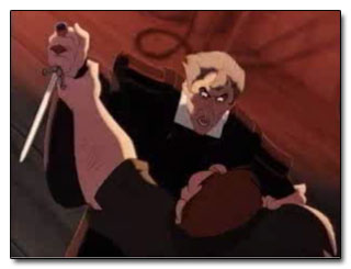 This one I enjoyed because it was fast to do: It's already very high contrast, and the color palate is very dour and limited. Which is kinda a nice change up when looking at Disney, and one of the many reasons Hunchback of Notre Dame is one of my all-time favorite movies. Anyway, not only does the hight contrast create drama, the fact that the whole composition is tipped diagonally makes it unstable, you don't know who will topple and win the fight! Your eye is bounced by way of the highlight from Quasi, to Frollo, to the dirk of doom as they struggle. Even those blurry bits of seemingly random rope whirl you in and out of the composition in a tangle of arms.

 This last one, I'll admit, my version looks pretty creepy. Mushy faces generally do. But you can see that the composition still works, because your eyes bounce away from his to look at Tink. The contrast of the left side of the frame against Tink's light rock your view over towards her. The glow at the horizon line points to her and the folds in the drapes run through her as well. It's like the whole picture is inclined towards her to hear what urgent thing she has to say. Or jingle rather. This version of the classic children's tale didn't do well in theaters, and I can't figure out why. While far more faithful to the book, it had a few details and relationships with a rather thought provoking spin on them. And say what you will about the story or the acting, it was visually stunning. A mix of color filters, cg effects, and deft camera work made it look like a painting come to life right out of a childrens book.
So there are my thoughts for the week. Goodness knows when I will have time to practice them, but hopefully this idea of color blocking, or as I like to think of them, constructo-blob, will help me push my paintings to new and greater hights.
But what I'm talking about deconstructing are scenes from my favorite movies. That's what my teachers should have done. In all fairness they did try to vaguely explain the idea of color blocking, roughs, and why it was a good practice to do them, but they always did it in terms of squares and circles and lines and dots. (Most of my teachers were modernists or abstract expressionists) I don't give a damn about squares. I don't care if these squares look odd when arranged against those circles, it doesn't really matter either way. One is just "more aesthetically pleasing" than the other. Yay. But put color and composition in terms of The Story, and it's a whole new ball game. If the light doesn't point this way, we won't know what time of day it is, or where the hero is going. If these shadows go this way, we know he's headed for trouble. If you turn the plane this way it's tramatic and unstable because there is a fight!...I could go on and on, but let me try to do what my teachers didn't and show you what I'm talking about.
I did a number of what I supose you would call color blocking excersises. It's what concept artists do when they are trying to decide what color pallette and compositional elements will work well for a scene. It's helpful because when there are no lines are involved, you really see how color defines your forms and directs your eye. Your eyes might not know what you're looking at, but your brain does!


On a side note, the contrast of the warm and cool tones very nearly has a graphic flatening effect, which we can see carry over into movies like Hercules and Emperor's New Groove, films that had many members of the same artistic team.


So there are my thoughts for the week. Goodness knows when I will have time to practice them, but hopefully this idea of color blocking, or as I like to think of them, constructo-blob, will help me push my paintings to new and greater hights.
Monday, August 15, 2011
A Kiss in the Crowd
The essence of both visual and dramatic tension is the moment or space where two points almost meet. Perhaps this is the reason why I have been fascinated by kisses for my entire life. The mechanics of a kiss is really pretty bizarre when you compare it to most of the other gestures we use when in social situations. I mean at what point did human beings evolve the concept that touching mouths is a thing that should be done? You'd think far differently of me if i went up and stuck my finger in your ear, right? But it's even such a complex gesture that it can't be contained by merely defining it as a motion of affection. There are as many kinds of kisses as there are people who give them. A kiss can be coy, passionate, aggressive, tender, impish, impetuous, or even confrontational. To me, it expresses all the things that can happen when two people are that far within each others boundaries of personal space.
Speaking of personal space, I tend to be very territorial about mine, and generally avoid places and scenarios where I am forced to share it. Which is why I surprised even myself by agreeing to go with my cousin to see the Darius Rucker Homegrown Tour concert. I think I wasn't expecting it to be all that crowded since he does it every year and hasn't been part of Hootie and the Blowfish for over a decade, but boy was I wrong. The stadium was packed by the time the warm up band finished. It was, of course, at that very moment when the bottom fell out of the sky in a torrential summer thunderstorm. The scene became a structurally reversed version of the Titanic: the rich folks stayed relatively dry and the rest of us in the cheap seats drowned. Because of the thunder and lightning we were forced to vacate the steel bleachers and wait out the storm in the gallery below. Of course with that volume of people nothing can happen fast, which made me wonder how it would have been had there been a fire, rather than mearly inconvenient and uncomfortable rain. So it took at least 30 minutes for us simply to get downstairs. Everyone was packed together, shoulder to shoulder, other parts to other parts, in a mass exodus that most of us silently agreed to get through as civilly as possible. But when you press that many people together when they can't move or really see where they are going, anything can happen. Two brawls very nearly happened when a man didn't appreciate people jostling his pregnant wife, and when a Jersey-born acquaintance of mine was accidentally shoved by then end of a domino-style series of stumbles as people tried to descend staircases littered with beer bottles.
But then something completely different happened. A blond teen with a crew cut practically leaped over three of his friends to kiss a girl not two feet in front of me. He must have called her name, because she turned her head. He reached his entire body towards her, grabbed her neck and pulled her to him. He kissed her in the dazzle of the downpour. It wasn't a Euro-hello kiss, nor some childish "ha! I got away with it" kiss. This guy made it count! I saw he had blue eyes and they sparkled as he went for it and as he withdrew. The girl smiled. But then much to my confusion, the boy withdrew and melted back into the crowd. He didn't stay and chat or greet her friend she stood with or say "Bye." And I was like "WTF?!!" Who are you? Who is she to you? Where are you going? Why aren't you staying? WHAT'S GOING ON? I found myself entranced by these kids story that I had virtually no information about. It was a story made of a single gesture.
Even if my phone hadn't gotten waterlogged and died, there would have been no way for me to whip it out and capture that moment. It happened in an instant. And plus if the kids saw me take a picture of their pda I'd have looked like a creeper. But I couldn't help it! It all happened 15 inches in front of my face! So I drew it. I'd like to take the time to work it into a fully completed drawing or digital painting, but only had time for a sketch this week.
 It's so hard to draw a kiss happening and make it look real and believable. So much lining up has to happen and then how do you not mash noses? Anyway, maybe I'll work on it and post some process updates later.
In the meantime, check out the art of Claude Theberge: http://www.claudetheberge.com/index.html Some of his paintings of people kissing are kinda goofy, but I love the energy that his figures and compositions have because everything looks like it's posing or taking place in a high wind.
Speaking of personal space, I tend to be very territorial about mine, and generally avoid places and scenarios where I am forced to share it. Which is why I surprised even myself by agreeing to go with my cousin to see the Darius Rucker Homegrown Tour concert. I think I wasn't expecting it to be all that crowded since he does it every year and hasn't been part of Hootie and the Blowfish for over a decade, but boy was I wrong. The stadium was packed by the time the warm up band finished. It was, of course, at that very moment when the bottom fell out of the sky in a torrential summer thunderstorm. The scene became a structurally reversed version of the Titanic: the rich folks stayed relatively dry and the rest of us in the cheap seats drowned. Because of the thunder and lightning we were forced to vacate the steel bleachers and wait out the storm in the gallery below. Of course with that volume of people nothing can happen fast, which made me wonder how it would have been had there been a fire, rather than mearly inconvenient and uncomfortable rain. So it took at least 30 minutes for us simply to get downstairs. Everyone was packed together, shoulder to shoulder, other parts to other parts, in a mass exodus that most of us silently agreed to get through as civilly as possible. But when you press that many people together when they can't move or really see where they are going, anything can happen. Two brawls very nearly happened when a man didn't appreciate people jostling his pregnant wife, and when a Jersey-born acquaintance of mine was accidentally shoved by then end of a domino-style series of stumbles as people tried to descend staircases littered with beer bottles.
But then something completely different happened. A blond teen with a crew cut practically leaped over three of his friends to kiss a girl not two feet in front of me. He must have called her name, because she turned her head. He reached his entire body towards her, grabbed her neck and pulled her to him. He kissed her in the dazzle of the downpour. It wasn't a Euro-hello kiss, nor some childish "ha! I got away with it" kiss. This guy made it count! I saw he had blue eyes and they sparkled as he went for it and as he withdrew. The girl smiled. But then much to my confusion, the boy withdrew and melted back into the crowd. He didn't stay and chat or greet her friend she stood with or say "Bye." And I was like "WTF?!!" Who are you? Who is she to you? Where are you going? Why aren't you staying? WHAT'S GOING ON? I found myself entranced by these kids story that I had virtually no information about. It was a story made of a single gesture.
Even if my phone hadn't gotten waterlogged and died, there would have been no way for me to whip it out and capture that moment. It happened in an instant. And plus if the kids saw me take a picture of their pda I'd have looked like a creeper. But I couldn't help it! It all happened 15 inches in front of my face! So I drew it. I'd like to take the time to work it into a fully completed drawing or digital painting, but only had time for a sketch this week.

In the meantime, check out the art of Claude Theberge: http://www.claudetheberge.com/index.html Some of his paintings of people kissing are kinda goofy, but I love the energy that his figures and compositions have because everything looks like it's posing or taking place in a high wind.
Monday, August 8, 2011
Light Feet and Heavy Thoughts
I actually had time to put paint to actual canvas this week, which is something I haven't done since I moved. When we left our old apartment, I had to sell/give away most of my artwork. I had a lot of stuff that had accumulated over two years, and swore I would focus on digital media once in our new place in order that my new office/studio should not become cluttered and overflowing with paintings. I failed. I just missed that visceral feeling of painting, of actually mixing the colors that never come out exactly the same way twice. The feel of it on your brush as you sweep it across the canvas. Though I have outgrown my idea of earning a living selling paintings on the roadside (granted, there are folks that earn a living that way. I have not figured out how. More power to them.) I feel it is something I will always come back to.
When my husband and I were living in Rock Hill, there was a gallery that we would visit upon occasion called Lark & Key. They have a wonderfully unique collection of dreamy, earthy works from their artists. Check them out at http://www.larkandkey.com/ My favorite artist is Duy Huynh. I always feel terrible that I can't remember how to spell or pronounce his name, but I wish I had a thousand dollars so I could have some of his work! His depictions of floating girls, shadowless birds, and contemplative youths in mysterious open spaces are just hypnotic. I literally stood in the gallery for fifteen minutes just staring at a single piece.
 This is a really bleary picture. I have the worst luck at photographing my work. Anyway, in addition to being influenced by Duy's work, it's also inspired in part by my friend Erin. When Erin was little, whenever she and her mom would drive by a memorial garden or cemetery, she would say "Look mom! A flower park! I want to go play in the flower park!" But of course her mother would never let her. I rather think I would have a different perspective on death if I were allowed to play gently in a cemetery as a child.
When my husband and I were living in Rock Hill, there was a gallery that we would visit upon occasion called Lark & Key. They have a wonderfully unique collection of dreamy, earthy works from their artists. Check them out at http://www.larkandkey.com/ My favorite artist is Duy Huynh. I always feel terrible that I can't remember how to spell or pronounce his name, but I wish I had a thousand dollars so I could have some of his work! His depictions of floating girls, shadowless birds, and contemplative youths in mysterious open spaces are just hypnotic. I literally stood in the gallery for fifteen minutes just staring at a single piece.

Monday, August 1, 2011
The forging of the A**Hole
For those of you who don't know and may possibly care, I'm currently working on writing a graphic novel. I feel silly trying to explain the premise, mostly because I'm sure it will offend hard-core zombie genre enthusiasts, but silly is exactly what I mean for it to be because silly is how I perceive the entire zombie concept... So there!
My zombie world is much more like our own, but full of undead people. Kevin is one of those, who is not only having to come to grips with being a rotting corpse, but having to contend with all the trials and tribulations high school as well. In addition, he has a crumbling home life, which brings me to the subject of today's post: Kevin's father Chet.
Chet is, for all intents and purposes, one of the villains of the story. I have to say, I am relatively new to the fiction writing gig, but I have to say without a doubt that the bad guy is the hardest to write! And even more so when all he really is is a massive jerk. Anyone can write a Super villain. You can go nuts! Everyone loves to write the Hitlers, the Voldemorts, the Magnetos, the Maleficents. A baddie on a grand scale is easy because going into it, everyone knows that this dude is pretty F***ed up! I mean, look at the outfit. The flunkies. The capricious insane gestures of grandeur. There's a theatricality that is undeniable and irresistible. They're fun to write, and fun to play.
But what about all the wannabees? The C-class villains, who, at the end of the day are the types that we deal with the most. Most of us will likely never deal with someone who is legitimately evil. Even though roughly a third of our government and business leaders have psychopathic and sociopathic personality markers, most of us will come up against people who are merely assholes.
But what separates these sorts of bad guys? Is a jerk the same as a bully? Is a prick the same as a douchebag? I felt like I needed to straighten this out, because I actually have three separate characters that I need to spread out over the spectrum of petty evil and I don't want them to all seem like cardboard cut outs of each other.
 I drew some sketches of Chet to help me. Sometimes the drawing of the characters expression, body language, etc, tells you things about the character that you didn't even know in the writing.
Initially, he seemed like a domestic bully. But Kevin has a bully at school, and I didn't want the relationship to be the same. After looking at the sketches, I felt like Chet's posture and falling-apart, disjointed body language weren't nearly aggressive enough to be a true bully. Passive aggression. That's Chet's style. He's resentful of the world because the Event (the unexplained whatever that caused 70% of the human population to go zombie-fied) also cost him his job, as well as his former college athlete good looks. He hates his boss for no real reason and embarks on several failed attempts to kill him and eat his brains, only adding to the hatred. He resents his family for not being the perfect 1950's style household that he once envisioned it to be. I haven't come up with a specific issue he has with Kevin, and I feel like that might be important. Kevin can't stand him in general because he's a jerk who lashes out at everyone.
I feel like writing dialog, getting into the head of a jerk, is really difficult because I've worked for the majority of my life not to be one! The kind of person who is rude to waitresses. The person who doesn't tip. Who can't appreciate anything from anyone. I can articulate all these things that I want Chet to be, but I don't know how to show him as such. I tried to do a little research on who are modern pop culture's greatest jerks and I don't want to dig any deeper because I can't stand reading about Kate Gosselin BECAUSE SHE'S SUCH A JERK! Lol. But probably exactly who I need to watch for inspiration. Her and maybe Hannity.
To complicate matters, my story is essentially supposed to be a comedy, so I have to make him a funny a**hole, and not so much of a jerk that the reader wants to walk away. Or more importantly, I want to walk away before I finish! I also want to give him a bit of a character arc, if only from bad to worse. (SPOILERS!) Ultimately, Chet drives away his family and descends into alcoholism. How do I make that funny?
Looking at my drawings, I feel like as a zombie, he should be more gruesome, but I want you to be able to see the shadow of his former self. To be able to tell he was once a good looking man, so there's some pity for this character who will ultimately and quite literally fall apart by the end of the series.
My zombie world is much more like our own, but full of undead people. Kevin is one of those, who is not only having to come to grips with being a rotting corpse, but having to contend with all the trials and tribulations high school as well. In addition, he has a crumbling home life, which brings me to the subject of today's post: Kevin's father Chet.
Chet is, for all intents and purposes, one of the villains of the story. I have to say, I am relatively new to the fiction writing gig, but I have to say without a doubt that the bad guy is the hardest to write! And even more so when all he really is is a massive jerk. Anyone can write a Super villain. You can go nuts! Everyone loves to write the Hitlers, the Voldemorts, the Magnetos, the Maleficents. A baddie on a grand scale is easy because going into it, everyone knows that this dude is pretty F***ed up! I mean, look at the outfit. The flunkies. The capricious insane gestures of grandeur. There's a theatricality that is undeniable and irresistible. They're fun to write, and fun to play.
But what about all the wannabees? The C-class villains, who, at the end of the day are the types that we deal with the most. Most of us will likely never deal with someone who is legitimately evil. Even though roughly a third of our government and business leaders have psychopathic and sociopathic personality markers, most of us will come up against people who are merely assholes.
But what separates these sorts of bad guys? Is a jerk the same as a bully? Is a prick the same as a douchebag? I felt like I needed to straighten this out, because I actually have three separate characters that I need to spread out over the spectrum of petty evil and I don't want them to all seem like cardboard cut outs of each other.

Initially, he seemed like a domestic bully. But Kevin has a bully at school, and I didn't want the relationship to be the same. After looking at the sketches, I felt like Chet's posture and falling-apart, disjointed body language weren't nearly aggressive enough to be a true bully. Passive aggression. That's Chet's style. He's resentful of the world because the Event (the unexplained whatever that caused 70% of the human population to go zombie-fied) also cost him his job, as well as his former college athlete good looks. He hates his boss for no real reason and embarks on several failed attempts to kill him and eat his brains, only adding to the hatred. He resents his family for not being the perfect 1950's style household that he once envisioned it to be. I haven't come up with a specific issue he has with Kevin, and I feel like that might be important. Kevin can't stand him in general because he's a jerk who lashes out at everyone.
I feel like writing dialog, getting into the head of a jerk, is really difficult because I've worked for the majority of my life not to be one! The kind of person who is rude to waitresses. The person who doesn't tip. Who can't appreciate anything from anyone. I can articulate all these things that I want Chet to be, but I don't know how to show him as such. I tried to do a little research on who are modern pop culture's greatest jerks and I don't want to dig any deeper because I can't stand reading about Kate Gosselin BECAUSE SHE'S SUCH A JERK! Lol. But probably exactly who I need to watch for inspiration. Her and maybe Hannity.
To complicate matters, my story is essentially supposed to be a comedy, so I have to make him a funny a**hole, and not so much of a jerk that the reader wants to walk away. Or more importantly, I want to walk away before I finish! I also want to give him a bit of a character arc, if only from bad to worse. (SPOILERS!) Ultimately, Chet drives away his family and descends into alcoholism. How do I make that funny?
Looking at my drawings, I feel like as a zombie, he should be more gruesome, but I want you to be able to see the shadow of his former self. To be able to tell he was once a good looking man, so there's some pity for this character who will ultimately and quite literally fall apart by the end of the series.
Monday, July 25, 2011
The Plight of the Princess: In Disney's Defense
I’ve been perusing a number of movie blogs lately that have been tracking trends in recent Disney and Pixar movies. It’s the usual really: condemnation for choosing marketability over substance, why can’t you make a good movie for boys?, why are your movies for girls so anti-feminist?, etc. It seems the studios can’t win for loosing these days. I never thought I’d say this, but I think I might just have to go to bat for Disney here.
If someone said “Disney” to you, chances are the first character to pop into your head wouldn’t be that studio-launching mouse. More likely it would be a young royal girl in a dress some tooth-curling shade of insipid pink or purple. Let’s face it, it’s good to be the princess. Sales of princess and girl-oriented paraphernalia grossed over five billion dollars last year. Is it because girls like pretty outfits or are we really relating to these twirly, helpless females?
I suppose the best place to look at what went wrong with the children is to go back to the beginning. Which means Snow White. Despite being the highest-grossing animated film of all time (adjusting for inflation), this is the Disney film that seems to be met with anything from groans and eye-rolls from feminists. And perhaps rightly so: the protagonist is a shrill ninny who gets lost in the woods, loves nothing better than to cook and clean for seven random men, and is wont to take food from obviously evil strangers. But look at the time period in which it was made. In 1937, Europe was on the brink of war. Women really were still expected to stay home and cook and clean and sing a merry song while they did it. The economy was in the gutter, the Hindenburg crashed in a fiery inferno, and America was looking for all the stupid wholesomeness it could desperately cling to while rocking back and forth singing to itself. It doesn’t matter if the characters are believable or not. They are distracting, by which I mean entertaining. The perverse beauty of it all, in my opinion, is that the flaws of this story are painfully obvious to even a child! I remember watching this as a five year old thinking, “She shouldn’t take food from strangers. She must not be very smart.” I don’t think that allowing your child to see this movie will result in her running off into the woods to join a hippie commune that talks to animals. Let’s just sit back and enjoy the silly antics of the vertically-challenged woodsmen and the beautiful color washes of the hand painted backgrounds.
I think it is also a good idea to point out is that a common influential factor in having a woodland twirling, creature serenading heroine is not writing her any other friends into the story! I’d probably be a socially mal-adjusted recluse if the only other people in the story were either trying to kill me for no real reason or rescue and marry me without so much as a how-do-you-do. Which brings me to my next movie; you guessed it, Sleeping Beauty.
It seems almost unfair that the princess Briar Rose, aka the Sleeping Beauty, gets the film named after her when she’s really only featured in about 30% of it. The real focus of the story is the efforts of the Three Good Fairies and the dashing Prince Phillip to save and preserve this porcelain princess from the evil clutches of Maleficent. And honestly, it’s because of this that I think it’s a pretty darn good movie. By ignoring the boring princess, we get to see some daring sword play from a legitimately handsome prince who actually has some lines, and ostensibly, something to say. We see the chemistry of conflict and comedy among three enchanted women who all have their own way of doing things, and we get to here these near-Shakespearean monologues from one of the most theatrically diabolical, bad-ass villainesses to ever wield a scepter! The movie works, Tchaikovsky’s score is sweeping and will make you waltz in your living room in spite of yourself, and the medieval-inspired animation is completely mesmerizing. Oh yeah, and there’s a princess too. Shame she wasn’t really the star.
I think there is definitely a lesson for girls here about what it takes to be the star of your own story: resourcefulness, courage, perhaps a willingness to not blindly follow your parents wishes. These are the traits exhibited by the prince. And as such, is there any reason why a male can’t be a role model for women? Even from a young age, I remember being far more interested in the Prince role than his female counterpart. Let’s face it, roles for men, were and to a large extent still are just better written. Girls get to wear pretty dresses but boys get to do stuff. To that end, I remember playing pirates with my sisters just as often as I played princess. Plus merging the two was pure gold: I dressed for several years as a pirate princess because the outfit was as sexy as it was simple: black leotard + black pants + boots/old jazz shoes + cape and/or whatever pointy object that could be concealed in ones boot/jazz shoe = instant badass. We were heroes and brigands, we were chicks with stories. And no amount of tea and crumpets could substitute for that. It taught me the character traits that I would come to find attractive and winsome not only in the men I allowed into my life, but what I expected of myself if I were to be the mistress of my own destiny.
Long about the 1990’s Disney began to rethink a number of approaches to the game of animation, not the least of which was rethinking the idea of the princess. And it only took half a century for them to do it. Yay. But worth the wait I’d say. That decade produced some of our more proactive princesses. For brevity’s sake I’m going to focus on Mulan and Jasmin, mostly because I find it ironic that these women seem the most modern and feminist of all the princesses in their attitudes towards their role in society, yet in both cases they come from stories set in male dominant eastern and mid-eastern cultures. Both of them go so far as to articulate their dissatisfaction with their situation: Jasmine overhears Aladin and the Sultan discussing Aladin’s potential as marriageable material for her, at which she indignantly shouts “How dare you! Standing around deciding my future! I am not a prize to be won!” Though in fact, in many cultures even today, that’s exactly what a woman is. But it sounds great to us lucky gals in the good old modern USA! YAY! Similarly, Mulan expresses her motivation for forsaking her spot on the match makers list and joining the army. Even in the face of court marshal and abandonment, she muses “Maybe I didn’t do it for my father. Maybe I did it so when I looked in the mirror, I’d see someone worthwhile.” Even in her moment of defeat, I can’t think of a better role model for girls. Not to mention, Mulan actually got to do some kung fu and blow stuff up.
Honestly, I’m not sure why these didn’t do better at the box office. I would have thought Mulan would appeal to boys as well as girls with both an interesting main character and plenty of action. Aladin did well in the box office, but strangely enough according to polls Jasmine still never ranks among the favorite or well known princesses. Mulan I guess looses points for not being a real princess, as much as a female protagonist. But Jasmine seriously has it all! She’s beautiful, has cool outfits, is the closest thing Disney has to sexy with a PG rating, she’s smart and resourceful and regal. And she has a freakin’ tiger for a pet! Not to mention, she happens to have landed a pretty decent prince. Aladin is probably one of the most three dimensional characters ever created by Disney. He has humor, brains, flaws, a character arc, all them fancy words that make a character likable and interesting. And even better, Jasmine herself is balanced fairly evenly against him. They actually have chemistry. They are the first Disney couple that actually bothers to go on a date before they get hitched. (In fact, they managed to cram a whole Saturday morning series out of that relationship before tying the knot. I guess you’ve got time to kill if you’re waiting for a street rat to afford an engagement ring.) It is for these reasons that Aladin the movie will always remain one of my favorites and Mulan and Jasmine mah 2-D sistas.
This last one’s a bit of a stretch, but only because it’s technically Pixar, though released by Disney: The Incredibles. Worth every bit of it’s Academy Award for Best Animated feature, this movie does the best job of any I have ever seen at addressing and balancing gender roles. The stretchy, sassy Elastigirl marries the stoic and somewhat traditional Mr. Incredible, and the two of them attempt to raise a trio of super children in a world that is no longer Super-friendly. This movie does a brilliantly subtle job of exploring the roles of both the main characters and thereby explores what it means to be a man and a woman, a husband and a wife, a super and vulnerable human being. I’ve said it before and I’ll say it again, the best stories come from being human. By exploring how Helen and Robert Parr cope with their super powers balanced against their secret identities when their family is threatened cuts at everything that makes us people. The fact that children are a part of the family and the story make it accessible to audience members of any age, and also increase that vulnerability. If super hero stories have taught us anything, it’s that having someone close to you gives your enemies leverage against you. “With great power comes great responsibility” in my opinion should read “With your first kid comes great responsibility.” But I guess that doesn’t sound as nifty. These characters go above and beyond the stand-by princess protagonist and the “I’ll save you” prince. This sentiment is solidified in the heat of the final battle when husband and wife have their own private battle (SO TRUE!). Robert tries to insist that Helen and the children flee to safety and Helen refuses, thinking Robert is motivated by selfish macho reasons. When he burst out “I can’t lose you again! I’m not strong enough!” We see every bit of fear and inadequacy revealed, at which time his beloved raises his face to hers and replies, “If we work together, you don’t have to be.” That is the essence of gender equality, and indeed true selfless heroism.
And yet this filmed was out-grossed by CARS!!!! WHY! Yes five year olds like tow trucks, but parents, you’re the ones buying this crap for them! This is what the real princess dilemma comes down to. It’s the same reason our country is facing an obesity epidemic. GIVE YOUR KIDS WHAT THEY NEED, NOT JUST WHAT THEY WANT! The same as a diet of fast food and high-fructose will result in fat children, the constant consumption of frilly dresses and tiaras will result in, well….a Kardashian. I’m not saying swear off all things Disney or even girly. I’m just saying everything in moderation. Let there be pirates as well as princesses no matter what your child’s gender. Let them have classical literature and art supplies as well as soccer balls and ballet shoes. Most importantly, talk to your kids about the things they watch and see if they’re getting the stuff out of it that you think they’re getting. Snow White may not have made me a simpering princess wannabe, but it may have made me more than reasonably frightened of snaggle-toothed old women. It’s not their fault that Medicaid doesn’t offer full dental coverage, but I’m still pretty sure they’re out to poison me with food.
Tuesday, July 19, 2011
winsome wine designs
I have an unfulfilled desire to design wine labels. I'm quite fascinated by them. Every time I'm in a wine shop or even my local grocery store I have to wander through looking at each one. It seems like there is just so much variety these days. At last! Wine itself is a bit of an off-putting beverage, conjuring images of snotty french folk and bored, unfulfilled housewives. I think the average person might pass up a bottle with a swirly scripted European name and a drawing of a stereotypical french farm thinking it's "just too fancy for someone like me". Can't say I blame them. The whole purpose of design is to tell you about the product, not just tell who you want to consume it. Wines are tricky enough anyway. It takes a bit of education on the subject to tell the many varietals apart just by looking at the bottle, let alone learn which types you prefer the taste of. Different vintages, ages, and growing regions affect even the bottles sold under the same name. So how is one supposed to remember one wine from another? Have no fear! Clever design is here! Here are some examples of ones that I found in my local grocery store:
 First weapon in the label designs arsenal: wow factor. These labels are somehow printed directly onto the bottle with a variegated texture that feels like the stone walls that the label represents. In addition to having a tactile texture that actually makes you want to pick it up, each varietal has its own illustration that looks like its own ancient Grecian frieze. I'm also a bit of an art history buff, so this caught my interest in that regard and reminded me that the braincells I was about to kill were really quite educated. I actually ended up purchasing a bottle of the Pinot Grigio and it tasted quite nice too. Ten points!

 Weapon number 2: Target demographic. Heck, women make up a large percentage of the wine-drinking population. We love to get together with our girlfriends, and drink and gossip. This wine maker totally tapped into that. Once again, a unique illustration for each varietal not only lets you remember the label but which flavor you prefer as well. I only ended up with a couple of images here, but the Middle Sister label offered at least five different varietals, each with a middle sister with outfits indicating a different personality. Women love that. We want to relate to our product. We want it to remind us of our friends. The merchandiser wants us to want to buy more and share it with our friends. And sisters. Which is exactly what I plan to do on my next trip to the store. This label is clever too in that it asserts the individuality of the center figure, and makes the lady customer feel that she too is making a unique choice of her drink. Also, the adjectives describing the personality of the figure on the label should hopefully describe the flavor or personality of the wine as well. Full marks!

 Weapon 3: Humor. I think having a good time is generally at the forefront of our minds any time we crack open a bottle. I love it when wine labels can acknowledge they can be part of that by not taking themselves so seriously. I love labels that use puns (pinot evil...Ha! and the monkeys...it works visually and verbally. Teachers say that's how students remember things.) My husband loves them to, so I would certainly look for a wine that had a wonky sense of humor whenever entertaining like minded individuals. And the Arrogant Frog...now that's both snarky and clever...because it's a french wine. And it can make fun of itself. Ha. I'd be willing to give such a drink a try.
  Weapon 4: Interactive. Now I've long been a fan of the Coppela winery, but this one certainly renewed my interest. I absolutely LOVE how the flip-book/film reel design of the label refers to Mr. Coppola's legendary work in the film industry. But because we recognize it as such, we again want to pick it up and see if it works. As much as I wanted to see if the figures appeared animated as I rotated the bottle, I was afraid to spin it too vigorously until I had purchased the bottle and consumed its contents. But I think a label like this definitely lends a whole new dimension to a game of spin the bottle!
 Weapon 5: Eye Candy. Labels aside, there is something intrinsically enchanting about a glass bottle. It's shiny, the shape of the bottle is fluid and pleasing to pick up. I compulsively collect these bottles as I do shells on the beach. Despite in both cases, the item is meant only to protect the substance within, and meant to be disposed of when it's contents are removed...BUT IT'S SO SHINY!!!! I love the bottle designs that make use of the color of the glass itself. It brings the aesthetics enforced on a designer by the very screen printing process to use shape and color and form to their utmost effectiveness. I've had the actual wine, this Valley of the Moon, and didn't especially care for it, yet every time I see it, I gravitate towards it like a child hypnotized by a gleaming lollipop saying "Mommy I want that one!"
 This is my contribution to the genre. I don't know if it remotely follows any of the qualities previously discussed, it just sprouted from a doodle in my sketchbook of some whimsical wine drinking zebras. It made me think of a warm summer afternoon somewhere in France on a holiday when nothing really matters but good wine, good food, good food and good friends. Cheers everybody!


Tuesday, July 12, 2011

Monday, July 4, 2011
....boom!

Monday, June 27, 2011
"To Whom it May Concern": Who's my audience and why should I care?
"Know your audience." This seems to be the mantra of many agents and publishers. I've been taking workshops here and there in my arduous quest to become a published writer and illustrator, and the phrase just keeps coming up. And it's a perfectly acceptable concern, really. The publisher is responsible for making the money come in after being handed your little gem of prose, and the first thing they have to know is where to put it on the shelves. Is it fantasy, or merely fiction? Are we expecting this to be read by third graders or could parents read it to preschoolers? Are you talking to teens or tweens? And aren't those both considered young adults? Sheesh! I like to be as organized and efficient as the next guy, but I always balk at the idea of putting things into categories in the face of the creative process. How can I think about my characters if I'm thinking about someone else, or how that someone else is going to judge them? It's like high school all over again: if you go through your whole day worried about what others think of you, you will spend your whole life hiding in your locker wracked by crippling self doubt and angst.
Writers on the other hand, seem to be more of the school of "Write something you want to read." What a novel idea! I mean, it only takes a few days or maybe weeks to read a book, do you know how long it takes to make one?! Months and years! At the end of the day (months, years...) I'm the one who has to spend more time with these characters, this story, than anyone else. Of course I should write what I want to read. I've had a lot of trouble reconciling this with the idea of writing to targeted age groups, because growing up, I feel like I never quite fit in them myself. My reading level was generally several grades ahead of that of my peers. And with the downward spiral that today's school system seems to be in, I don't even know what "sixth grade reading level" means. Is it the same as when I went to school?
In addition to vocabulary and understanding plot structure, there's the matter of subject. What subject would intrigue an eighth grader? A high schooler? The thing that publishers forget is, there are a million different kinds of kids out there! They are all individuals! Some like cheezy romance, some like sci-fi, some like comedy, or suspense, or (cough* cough* dry heave) vampires. Some like all of those or combinations of them. And this just in, you grown up types, kid's HATE being put in boxes like this. I always hated when teachers would talk to me about reading level because I felt like they were being patronizing and talking down to me. As if there were lofty concepts in those golden tomes that I was too immature to understand. Granted, they may have been trying to protect me from "Mature Subject Matter" ie: sex. And maybe some violence, but I think nobody's really as concerned with kids reading about violence as they are them seeing it in film, but that's a topic for another day. No, what this issue comes down to, as most other do, is sex. The "Young Adult" label generally at one point or another comes with some sort of sexual encounter...or two...or three. Are they doing it because that's what teens want? Is that what girls want? I have to say, I always resented that as a teen, every time I wandered over to the shelves supposedly intended just for me, the books and graphic novels were filled with angsty girls and guys that were, in there own way, every bit as impotent as the Disney characters I'd grown up watching only at least Disney princesses had the decency/sexual repression to keep their clothes on and, I dunno, not get knocked up. I would be a fool if I didn't admit that teen pregnancy and all the emotions and confusion leading up to it weren't part of the teen/young adult experience. And I understand that teens need to relate to characters. But if you have to deal with that stuff all day, why would you read about it in your spare time? I have to say that I always took it a little personally to think that that's how publishers and writers perceived me as an audience member. So I wandered away into the Fantasy section and waited for Harry Potter to come out.
Speaking of The Boy Who Lived, Harry Potter is an excellent example of my last point: mass appeal. I love Harry Potter. So does the third grader my mother tutors. So do boys and girls, men and women, of all ages. You have a generation now who grew up reading it, and still more join the throng every day. Copies of The Half Blood Prince sold over 9 million copies in the first 24 hours of its release. The big question: HOW DID JK ROWLING DO IT?!!! How do you create characters and a story line that has this much appeal? I think it comes right down to what makes us all human. Rowling imbued her characters with humor, frailty, courage, and selflessness. She didn't make any of them perfect, and in doing so, crafted them perfectly. She didn't make them children, or teens, or adults. She made them people. She gave them qualities that no matter who you are or what your situation in life, you could relate to them. She also didn't add anything that didn't need to be there. Sex wasn't important to the story, so there was never a scene like that, although as the children became teens she could have orchestrated it that way. In terms of violence, the books take our heroes through a war, and violence happens in war. In addition, there was always the stark contrast of how the good guys and the bad guys used violence. The baddies are always needlessly violent, cruel because they can be. The hero rises out of need to defend those he loves. Those are ideas that we can relate to, idealize, and hold dear whether we are 9 or 90. That's why you have folks in their 50s who still love Star Wars. Why young professionals still collect comics. No matter what the window dressing, the magic, super-powers, jet-setting lifestyle, whatever, it all comes down to a human soul.
Thursday, June 23, 2011
Summer sketchy-doodles
Hey, sportsfans! Or beachfans rather. I'm in full summer mode, and in honor of the first day of the season, thought I'd toss up some beachy sketches. These were heavily inspired by one of my favorite contemporary artists, Vera Brosgol. Check out her site at http://www.verabee.com/ . Also give her brand new graphic novel a look: Anya's Ghost, available on Amazon for those of us not lucky enough to be able to attend Stumpfest or any of her other cons. Speaking of Comic conventions, are there listings of those somewhere? Are there any on the east coast that lean more the indie way? I've only ever been to the HerosCon in Charlotte, which is great and all, but seemed rather traditional for my tastes. Anyhoo, splashy splashy!
![]()
![]()


Monday, June 13, 2011
The Elephants of Design
I’ve decided I’m going to make a more conscious effort to apply the elements of design to every aspect of my life, not just my artwork. The elements of design have a lot in common with zen philosophy, I think, and moving into a new apartment has presented me with an opportunity to make a number of positive changes in my life. So here goes:
The first thing we have to do is remember exactly what the elements of design are. In art school we are told we must learn them so we can forget them. (Talk about zen, huh?) With a little memory jog from Google, the elements of design are as follows….ok, well seeing how there are often multiple words for the same principle, and internet sources don’t always agree here is what I have come up with:
Principles of Design
Economy
Rhythm/repetition
Balance
Movement
Unity
Gradation
Contrast
Dominance
Scale
First of all, economy was the principle that made me no longer have the school books that have economy’s definition in them. I gave/threw them away because they took up too much room on my shelves and I hardly ever used them. That’s economy. Both in art and in life, if you don’t need it, get rid of it. It’s hard sometimes; take it from a recovering hoarder. The excuses of “Oh I’ll need it one day,” “I spent money and resources on that!” or “I worked really hard on that one little piece of that project but it doesn’t match now!” often prove too persuasive. But just let it go. Your life, your space, your work will thank you.
Rhythm and repetition are often used interchangeably in the design world, but I think there are subtle, even opposing nuances to their definitions. To me rhythm in a piece of art gives it energy. Like the visual translation of a piece of music, it makes your eyes want to samba across the artwork and enjoy looking at it and how it makes you feel. Repetition on the other hand, seems like it creates stability. Your eye doesn’t panic or get jerked around because there is more of the same shape or color coming up, letting your eyes just glide around and hang out. It’s more restful, I feel. Both use a pattern of colors or shapes, but to slightly different ends. Your life needs degrees of both rhythm and repetition. In today’s world where so many people are unhappy with jobs where they do the same thing day after day might think this sounds horrible. The same thing every day might be a good example of too much repetition. But I have found that have something to look forward to every week or a small moment every day gives us a sense of stability in our fast-paced lives, something we can trust and rely on as an anchor in our week. Going to church, having a meal with friends, stopping at a local pub for a beer on Fridays, or taking 15 minutes to unclutter your desk on Monday morning lets your brain relax and create order. In addition, sometimes doing boring mundane like filing or stocking shelves gives your brain a chance to let your body do the work and take a moment to look at a view or a problem it had never noticed before.
Movement seems to be a term not consistently classified as a principle, but I’m including it because it’s useful. In artwork, having shapes that direct your eye to or away from the main subject lets you have a visual journey. It lets you discover details of the surroundings and other shapes, lines and textures rather than slamming you to one bright red spot in the middle and being done with it. Movement and journeys are what make life interesting, not to mention healthy. SO MOVE! Having just hauled all my possessions into a new apartment I can say, yes it can be rather stressful, and I won’t do it on that scale for quite some time, but I can still summon the energy to go for a walk! Also having one less car has me and my husband doing a great deal more walking, and even though we’ve moved back to the area I grew up in, I confess I’m seeing it in a whole new way! New buildings, new spaces, things you don’t notice when wizzing by at 60 mph. Not only do new environments stimulate your brain, but so do the chemicals and endorphins from moving your body in a brisk and calorie-burning fashion. Ok, you got me, I need to do more of that. But whether it’s hiking the Appalachian trail, or taking that pilates class that your sister was so stoked about dragging you to, getting off the couch is the first step.
Gradation is kind of an odd one to apply to life. In art gradation of color or value makes objects appear to have volume and weight. It can also be used in adjusting the size of objects to create a sense of space. Big to little, light to dark, etc. Philosophically, I’m going to take it to mean that you don’t have to do or have everything all at once. Have patience with yourself. When making changes or starting something new, take baby steps, it’s ok. Steps added together equals progress.
Scale is something I think America has a rather warped perspective on. We are such a vast country, over half of our landmass is open space, it’s a perfect breeding ground for the philosophy of “bigger is better!” But in our new smaller apartment, I’ve had to confront the notion of downsizing, and have come to see it not as a punishment of privation, but a simplifying of the space I use daily. In a small space, clutter happens easily, and I have to actively combat my tendency to just let junk lay around wherever I put it. Smaller cabinets, smaller refrigerator make me realize just how much food I realistically eat in a week, I don’t need to stock up to feed an army. I appreciate the intimacy of a smaller space and can appreciate it for how it shapes the life of me and my husband. I guess the lesson is, space is something that we are in this country blessed with a lot of, and spaces come in all sizes and shapes. Find one that is just right for you.
Contrast is fun in design because it creates surprises. Contrasting colors or values are what give objects in art that “pop”, thrusting things into prominence and making us confront either the objects themselves or the relationship between the objects. My favorite use of contrast is often used in character design and story telling: the young cowboy in the white hat going up against the big ugly black-hatted outlaw and his dastardly dark band of banditos! Or for even more interest and perhaps even humor, the big bad outlaw turns out to have the personality of a push-over cry-baby, characteristics in direct contrast to his outer appearance. You are surprised, or find yourself engaged and rooting for someone; you become invested because you find you have something in common with the objects or characters you’re looking at. So for more contrast in your life, do something outside your comfort zone. You may discover you like Thai food, or at least learn to laugh at yourself as your first attempts at throwing pottery look like they would be more comfortable in a nuclear hellscape. Even saying hello to a stranger in the grocery line might be the beginning of a fascinating and fulfilling relationship.
I’m going to tackle dominance and balance together because they seem at odds in real life. Dominance is pretty self-explanatory. It is the thing that defines. The piece, the picture, your work, your life. It’s the thing that you focus on. It’s rather hard, because often the thing that dominates our lives isn’t the thing that we wish it was. Work, neuroses, a bad relationship, addiction, a new baby, anything really. We feel that these things define us and they can be very difficult to change because often we don’t have as much control over them as we think we do. That’s where balance comes in to mitigate the power of dominance. By asking for help, letting go of some things, re-prioritizing the things that a truly important to us, we can introduce new elements into our lives that bring balance. Nobody can “have it all”. And really, it’s a pretty silly thing to wish for when you think about it. I think if I had everything, each thing would get approximately 20 minutes of focus, and what real enjoyment can that bring? Our culture is ADD enough as it is, not to mention sleep deprived. But I think there is a certain peace, a balance, that comes with letting go of everything and settling for what is important. Chances are we’ll all have to work for a living, maybe not at a job we love. We may wish we had more money, less taxes, more time, more vacation, shorter commutes, more hair, less weight, more shoes, blah blah blah. Focus on the picture in front of you, the life in front of you, and arrange the pieces as they come, and let them go as they depart. This is balance.
Saturday, June 11, 2011
Post Numba 1
I never know how to begin...
Why is a blank page so much more intimidating than a blank canvas? You would think they'd be the same, but no. Maybe it's because, for me, words come before pictures. That seems evolutionarily backwards. Maybe because I rely largely on inspiration when I draw. Draw a blank, or from a blank. I mean with no direction. A blank canvas is a thrill to me: a vast empty playground of potential waiting for my paint, my mistakes, my experiments. If it doesn't work, slop some gesso over it and start blank again. You use what you learned and erase what didn't work to make something new and better.
But words? Ah, words are a whole new world. Words take discipline. Forethought. Planning. You have to order complex sequences of thoughts, not to mention order the letters to express them. And they seem so permanant! I was always taught "think before you speake, because once you say something, you can't take it back." My mother was trying to get me to be nice, but it taught me the earth-moving power of words. Once they are on the page, you can't un-make them. Pencils have erasers, sure. Pencils to this day are my best friends. Ink terrifies me. It has such permenance! If you mess up, you scratch it out, but it just stays there. Under the scratches, forgiven but not forgotten. You just do your best to move on.
Typing is a little more friendly, in that it is itself inconsequential. I can go fast, letting my fingers fly, my thoughts folw, no editing. Then I can stop, breathe, read, spell check. If it's all total rubbish I can highlight the whole thing and summarily execute it by hitting Delete, Deus Ex Machina style. Or treat it to a slow, dramatic, agonizing demise one character at a time by holding my finger on the backspace key. Because it's not real untill you hit print. Even "send" or "post" don't have the impact for me that "PRINT" does. "Is that your final answer?" it asks. "The answer should nearly always be "no". I will have to become more friendly with the notion of the rough draft if I am to consider myself a writter. Anyway, only printing makes it real. Words that I can hold in my hand. Words that might even outlast me. Words on the computer, those aren't real. Anybody can put any words on the Internet that they want. And yes, I am aware of the irony of you being able to read this in a blog. What does that make me now? That's probably the reason it took me years to succumb to the notion of a blog in the first place. I feared not only my words coming back to haunt me, but somehow despite their power, words seem more vulnerable than pictures. I mean look at them: just a bunch of squiggly lines strung together. Extra slanty and squibbly in my case. How can they withstand the world? How will they not crumble undercriticism? Pictures are subjective. It takes a certain degreee of education on the subject of art to properly criticize a picture. Yet to the public at large, personal taste is often the directing factor. As such, whenever I hear things like "I don't like it," "That painting looks like a four-year old did it!" and "It doesn't have enough cats in it, you should draw more cats!", I can just roll my eyes and huff a deep breath, and let it go.
But there are no two ways about words. Not to most people anyway. People get so swept up and moved by words. Words can make a person want to attack another person. My words can make someone want to attack me! It seems like it takes so much more courage to share my words with someone than say "Hey, look what I drew," When you give words, people nearly always want to give some back. That's a magic that binds us together as human beings. And I want more of that in my life. And so I started this blog to make myself share more, work more, listen more, read more, write more, and be more. And in exchange, I beseech you, dear reader, a bit of patience, perspective, and humor. If you lack those things, I'm very sorry. But at the end of the day these are just words. And pictures. Enjoy!
Subscribe to:
Posts (Atom)