Once again, it comes to my attention just how badly the art education system has failed me. I don't blame my teachers, very few of them knew how to reach me, and until you can figure that out, one might as well be trying to explain design principles to a wheelbarrow. Anyway, it's up to me to teach myself, and I figured what better way to do that than by taking something apart and looking at its pieces. Worked for dad and the VCR, right?....no...no, it didn't.
But what I'm talking about deconstructing are scenes from my favorite movies. That's what my teachers should have done. In all fairness they did try to vaguely explain the idea of color blocking, roughs, and why it was a good practice to do them, but they always did it in terms of squares and circles and lines and dots. (Most of my teachers were modernists or abstract expressionists) I don't give a damn about squares. I don't care if these squares look odd when arranged against those circles, it doesn't really matter either way. One is just "more aesthetically pleasing" than the other. Yay. But put color and composition in terms of The Story, and it's a whole new ball game. If the light doesn't point this way, we won't know what time of day it is, or where the hero is going. If these shadows go this way, we know he's headed for trouble. If you turn the plane this way it's tramatic and unstable because there is a fight!...I could go on and on, but let me try to do what my teachers didn't and show you what I'm talking about.
I did a number of what I supose you would call color blocking excersises. It's what concept artists do when they are trying to decide what color pallette and compositional elements will work well for a scene. It's helpful because when there are no lines are involved, you really see how color defines your forms and directs your eye. Your eyes might not know what you're looking at, but your brain does!


This scene from Kung Fu Panda was the first I attempted, and I felt it was a bit hard. I think my Histogram was destracting me. I was trying to get all my contrasts to match and was having trouble controling them, but that may be because I didn't have small areas of contrast in details the way the final image did. Either way, I think I was on the right track because when you squint the pictures look very similar. I so loved the asian influences on the camera work in this film. The zen rhythm of the rocks, the contrast of scale, signature influences of asian brush paintings. Our eye takes a journey before resting on Po, the focal point and area of highest contrast. It's a surprisingly restful view even though Po just got his but kicked!


I don't think I even need to post the original screen shots for these two. I love the color palate in Aladin! Hot oranges complimented with a deep, yet still slightly warm purples and blues! You totally feel the desert: scorching heat of the day, with the cool but deep lingering warmth left over after sunset. A sexy setting for a sexy couple if I do say so myself. You can really see the color working in this second piece: The warmth, the highlight, the emphasis is on Aladin. He's the hero, he's the one reaching and striving for the cool calm princess, we are ultimatly following him not only on his journey, but through the simple and real motion of a kiss.
On a side note, the contrast of the warm and cool tones very nearly has a graphic flatening effect, which we can see carry over into movies like Hercules and Emperor's New Groove, films that had many members of the same artistic team.
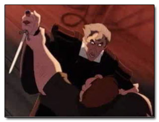
This one I enjoyed because it was fast to do: It's already very high contrast, and the color palate is very dour and limited. Which is kinda a nice change up when looking at Disney, and one of the many reasons Hunchback of Notre Dame is one of my all-time favorite movies. Anyway, not only does the hight contrast create drama, the fact that the whole composition is tipped diagonally makes it unstable, you don't know who will topple and win the fight! Your eye is bounced by way of the highlight from Quasi, to Frollo, to the dirk of doom as they struggle. Even those blurry bits of seemingly random rope whirl you in and out of the composition in a tangle of arms.


This last one, I'll admit, my version looks pretty creepy. Mushy faces generally do. But you can see that the composition still works, because your eyes bounce away from his to look at Tink. The contrast of the left side of the frame against Tink's light rock your view over towards her. The glow at the horizon line points to her and the folds in the drapes run through her as well. It's like the whole picture is inclined towards her to hear what urgent thing she has to say. Or jingle rather. This version of the classic children's tale didn't do well in theaters, and I can't figure out why. While far more faithful to the book, it had a few details and relationships with a rather thought provoking spin on them. And say what you will about the story or the acting, it was visually stunning. A mix of color filters, cg effects, and deft camera work made it look like a painting come to life right out of a childrens book.
So there are my thoughts for the week. Goodness knows when I will have time to practice them, but hopefully this idea of color blocking, or as I like to think of them, constructo-blob, will help me push my paintings to new and greater hights.


No comments:
Post a Comment